Rupeezy · Product design case study
Making partner progress and earnings visible in one place
I designed Rise Portal from 0 to 1 so Rupeezy’s digital partners could track lead status, understand earnings and check payout eligibility without relying on routine updates from the team.
Context
An important channel, without a self-serve product.
Digital partners referred prospective clients to Rupeezy and could earn a share of the brokerage from their clients’ trading. A small group drove a large share of the business.
Company context
~100
digital partners
~35%
of company revenue came through them
The problem
The question wasn’t only “How much did I earn?”
Yet partners had no portal where they could follow lead progress or understand earnings on their own. Routine questions went to the internal team, and some were harder than they looked.
“Last month I referred 100 people and earned X. This month I referred 200 and earned less. Why?”
A total couldn’t answer it. The partner needed to see where referrals were in the journey, how client activity related to earnings, and whether payout conditions were met.
Evidence & insights
Useful internal signals. No direct partner interviews.
I worked from recurring support questions and from the product manager, the business team, Support and the partner relationship managers. I didn’t interview partners before launch, so I treated these as indirect evidence and matched my claims to it.
Support questions
Where partners got confused, and which updates they asked for again and again
How often each issue came up
PM and business
Product goals, the payout rules and how the channel worked
How partners think about their earnings
Support team
Which questions reached the team, and what information was missing
Questions partners never raised
Relationship managers
Common partner concerns and how partners worked day to day
Partners completing tasks themselves
None of them could show mepartners working through the tasks themselves
What it showed: three jobs behind the routine questions.
Across the sources, the same three questions kept coming back. I organised the problem around them, around what a partner needed to do rather than Rupeezy’s internal teams.
“How is my partner business doing?”
Dashboard
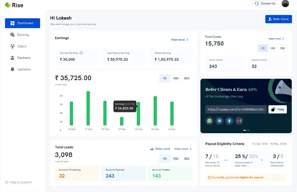
Earnings, an earnings trend, the lead funnel and payout eligibility.
“Where is each lead in the journey?”
Clients
Scannable lead and client statuses, with contact details kept private.
“How much have I earned, and why?”
Earnings
Current, pending, last payout and total earnings, with history.
The three questions, mapped to the structure that shipped.
Design approach
The goal wasn’t another report. It was a usable next step.
A portal can show plenty of data and still leave partners unsure what it means. Each screen had to answer the immediate question, give enough context to trust the answer, and point to what to check or follow up next.
How might we
help partners see how their business is progressing, understand what their earnings mean, and know what to do next, all in one place?
Dashboard · Clients
Visibility
Make status and earnings easy to find.
Earnings · Eligibility
Interpretation
Explain what the values and the payout rule mean.
Clients
Action
Show which leads might need a partner’s follow-up.
Make it easy to scan before making it detailed.
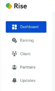
I built the portal around three connected areas. Each starts with a summary and lets a partner go deeper when they need to. Status names and criteria are always on screen, so nobody has to remember a phone call or rebuild a calculation.
Dashboard
Earnings summary, earnings trend, the lead funnel and payout eligibility.
Clients
Client overview, lead statuses and the client list, with phone numbers masked.
Earnings
Earnings trend, client earnings, payout history and four earnings totals.
Partners and Updates sat alongside, for referring other partners and for messages such as payout notices.
The solution
Four areas, each answering a partner question.
The dashboard gives the overview. Client tracking and earnings carry the same questions into detail, and the mobile app keeps all three within reach.
Show the trend, the funnel and the payout status.
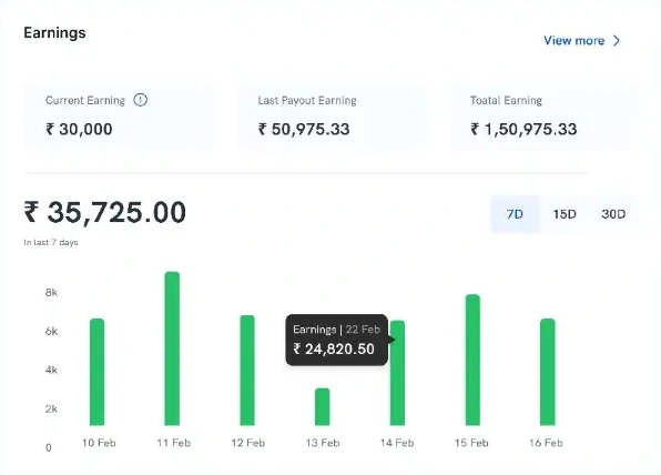
The dashboard brought several questions into one view. Instead of a single headline total, it paired earnings with a trend over time and the state of every referral.
Earnings, and the trend behind them
This cycle, the last payout and the running total, with a 7, 15 or 30-day chart beneath, so a change has a shape and a date.
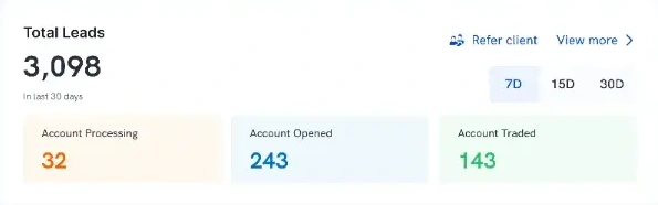
Where every referral is
Leads split by stage, so a partner can spot one that hasn’t moved.
Detail from the desktop dashboard. Payout eligibility sits below these, covered further down.
Make lead status visible, and the limits of it too.
The client view showed each lead’s stage, so a partner could tell an account that had opened from one that had started trading. Opened wasn’t the same as active or trading.
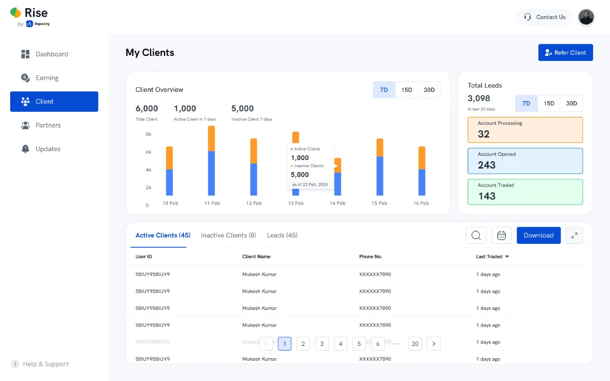
My Clients on desktop.
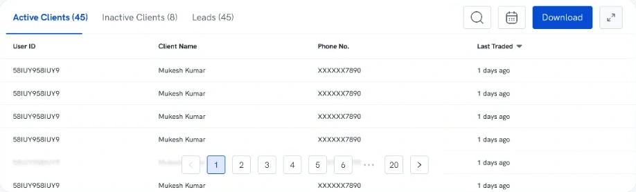
Phone numbers stayed masked
Privacy came first. The trade-off: a partner who hadn’t kept a lead’s details had no number to follow up with.
Show more than one earnings number.
One total couldn’t answer every earnings question. The earnings area paired a trend and client-level earnings with payout history, and separated four totals that a single number would have blurred together.
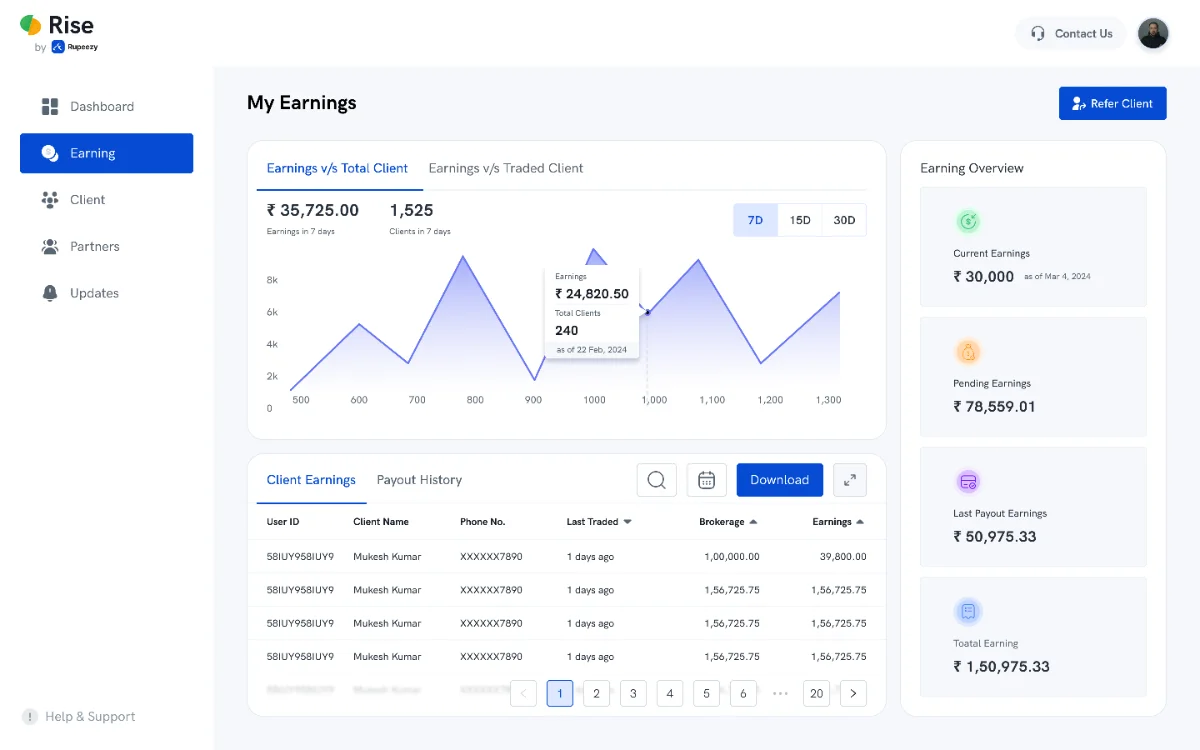
My Earnings on desktop.
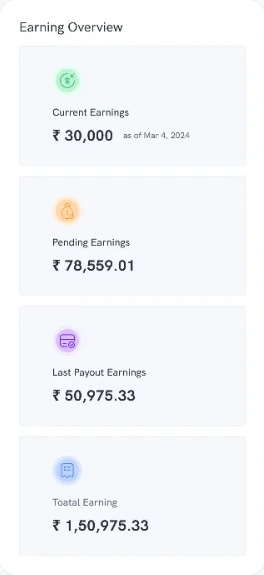
Current Earnings
This cycle so far, with an as-of date.
Pending Earnings
Earned, not yet paid out.
Last Payout Earnings
What the most recent payout contained.
Total Earning
Everything earned to date.
Show progress toward each condition, not just a verdict.
Eligibility depended on more than one threshold. The business defined the rule; I designed how it reads: progress against each condition, and a plain message when a partner didn’t yet qualify.
Required
10+ active clients
7 / 10
and
Either one of
30%+ of clients active
25% / 30%
or
5+ new clients this cycle
3 / 5
The rule: 10+ active clients AND (30%+ of clients active OR 5+ new clients in the cycle). Progress values are example data from the interface.
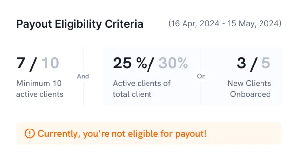
The grouping is in the layout
The required condition stands alone. The two alternatives share one tinted block, and the message names the outcome.
On the dashboard, eligibility sat below earnings and clients, which partners checked more often. The cost of that choice: a partner who didn’t know the rule had to scroll to find it.
The same three jobs, on a phone.
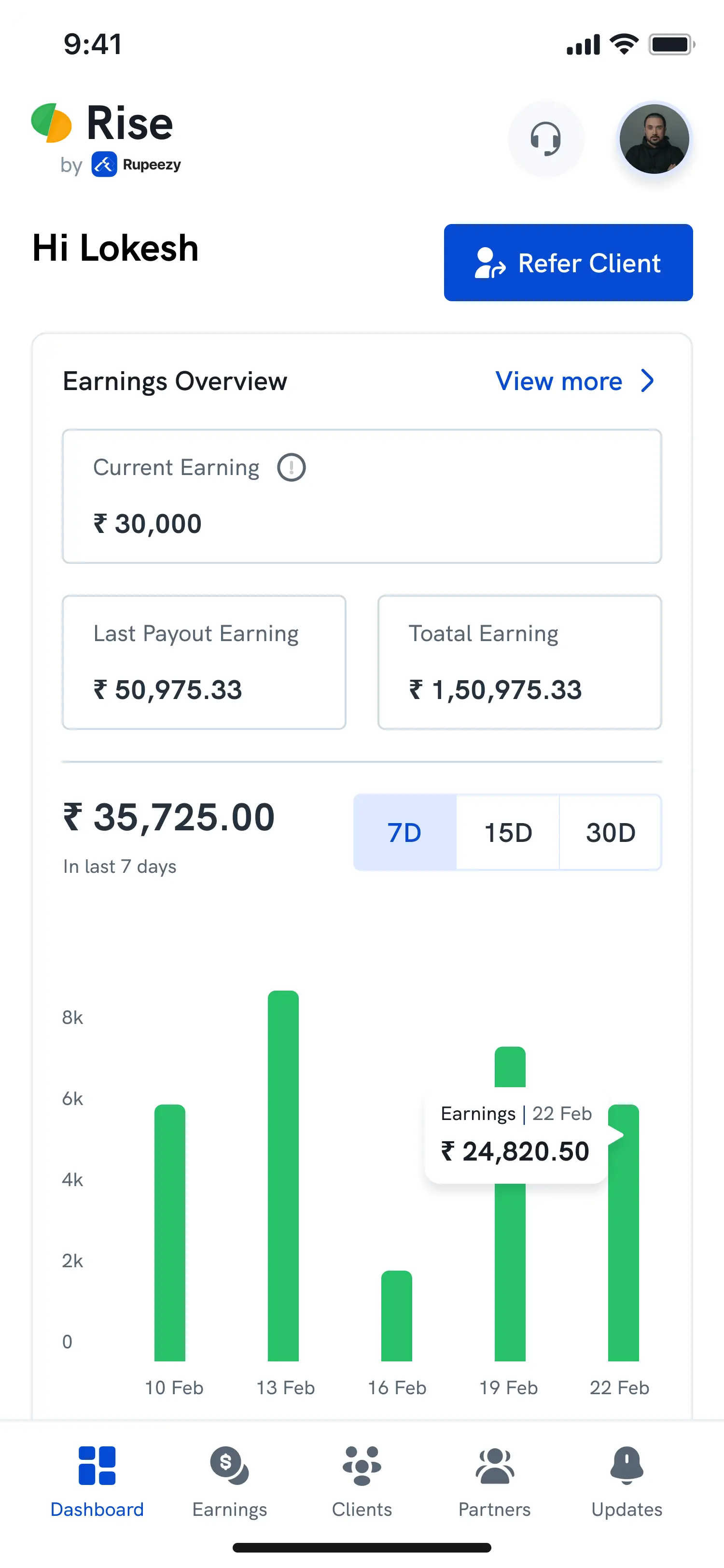
Progress, clients and earnings carried over to mobile. A bottom tab bar replaced the sidebar, summary cards stacked, and the 7D, 15D and 30D ranges stayed one tap away.
Progress
Dashboard, with earnings first.
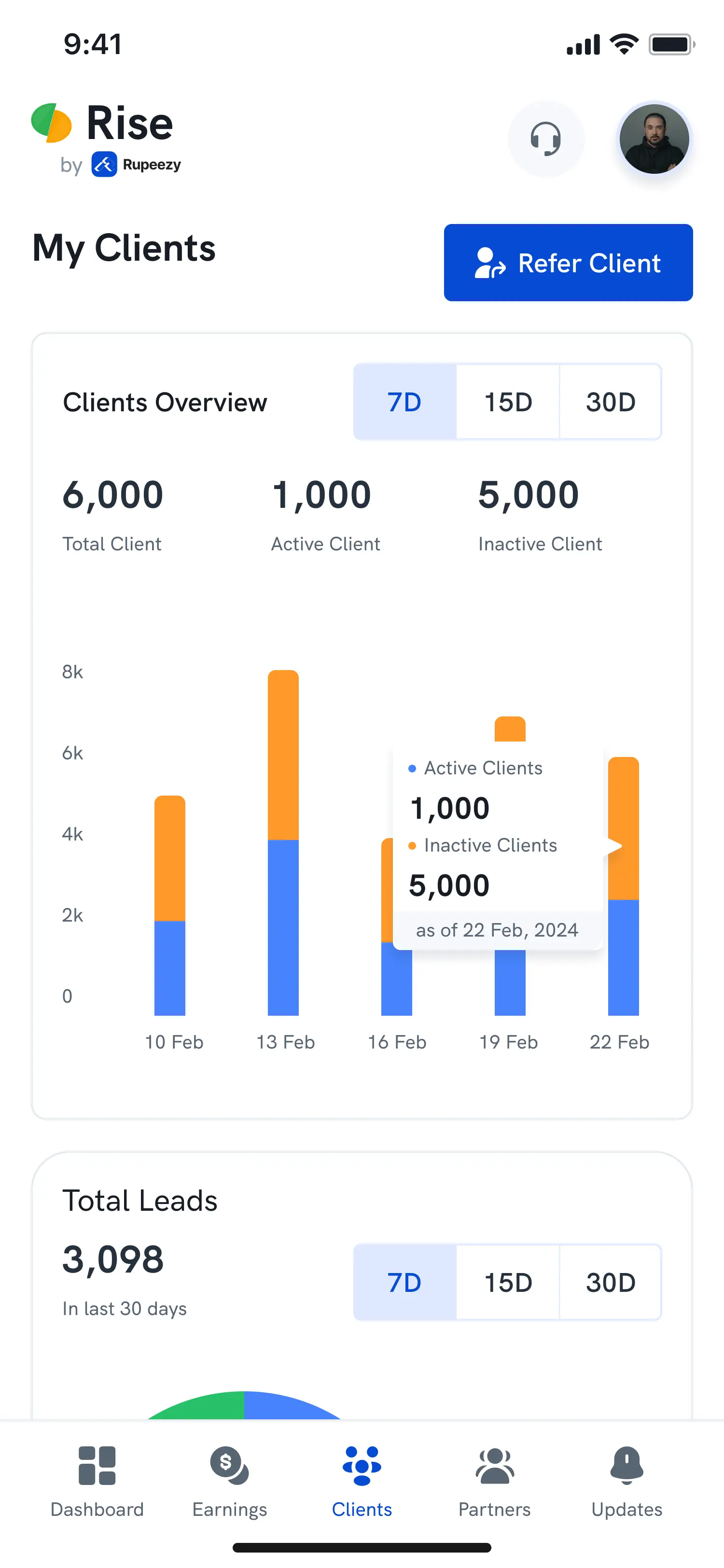
Clients
Client overview and leads.
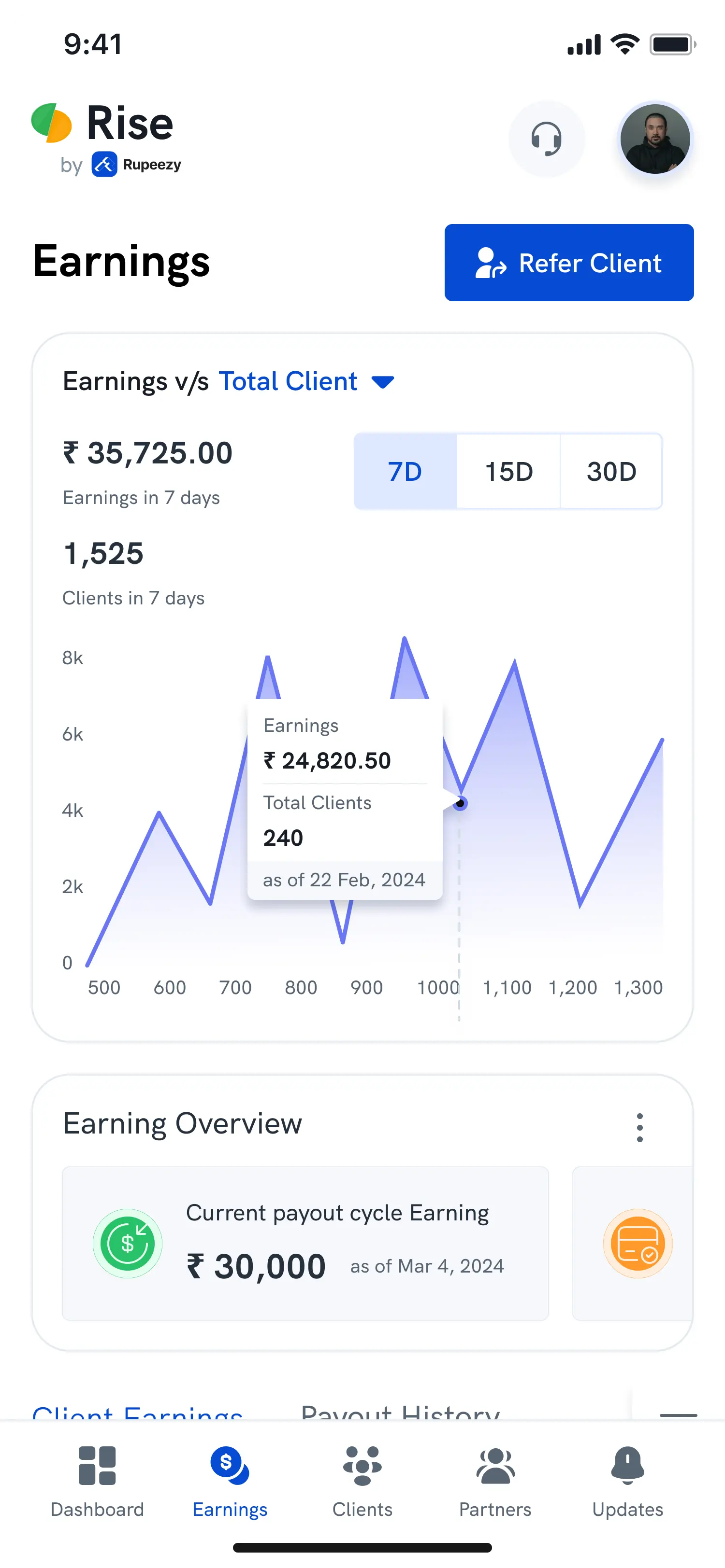
Earnings
Trend, then the earning overview.
Outcomes
The teams reported positive changes after launch.
2.4×
lead-to-client conversion
Reported by the business team, over two months
48%
fewer partner support tickets
Reported by Support
Team-reported. I didn’t measure these myself, and the portal was one of several factors behind them.
Reflection
A dashboard isn’t the same as solving a visibility problem.
Rise Portal gave partners one place to check progress, client status, earnings and payout eligibility. Watching partners use it would separate what’s visible from what’s understood and acted on, especially the payout rule and a stuck lead.
Next time
I’d involve partners earlier, and agree how success is measured before launch.
Question 1
How do partners interpret their earnings?
Question 2
Which information do they trust, and how do they check it?
Question 3
What do they do when a lead is stuck and the number is masked?
Can partners explain the numbers, and act on them?
I’d start with three to five partners and the tasks that motivated the portal, watching where it’s clear, where they assume wrongly, and what still sends them back to the team.
Explain the eligibility panel
Do they read the AND / OR rule correctly, condition by condition?
Find a client who needs attention
Do the status labels point to a useful next step, and are the contact details enough?
Explain the four earnings totals
Can they tell current, pending, last payout and total apart?
Find a payout’s details
Task completion and time to the right field.
Decide what to do about a stuck lead
The action they choose, and what extra information they ask for.
Before claiming impact, I’d agree definitions, a baseline and a time window for support requests per active partner and lead-to-client conversion, alongside task success and eligibility-reading accuracy.